Art of Espresso Redesign
Project Overview
This project was for my COGS 187b class, a design course at UCSD. Our prompt for this project was redesign or design a website and mobile app for a client. Our client was a small coffee stand on the UCSD campus, The Art of Espresso.
For this project we just wanted to update the site to be more modern while maintaining all of the information of the current website. For this project I was a UX/UI Designer.
The Problem
How can we redesign The Art of Espresso website so that it is modern while maintaining the brand identity?
Users of The Art of Espresso website should be able to tell that website belongs to a small coffee shop, and be able to quickly get any information that they are looking for.
Research Methods
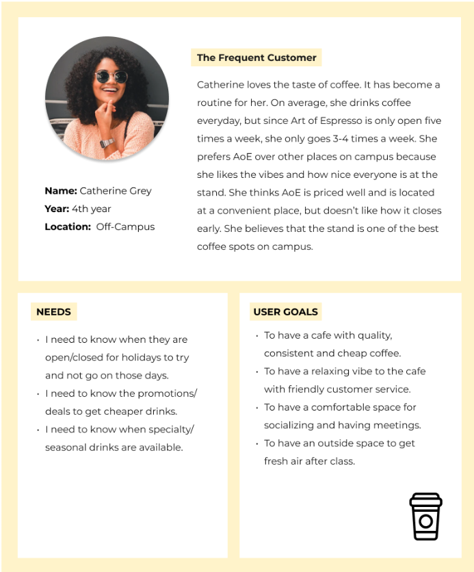
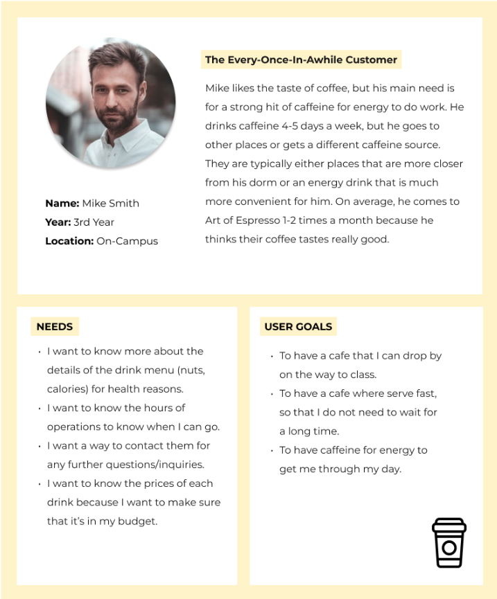
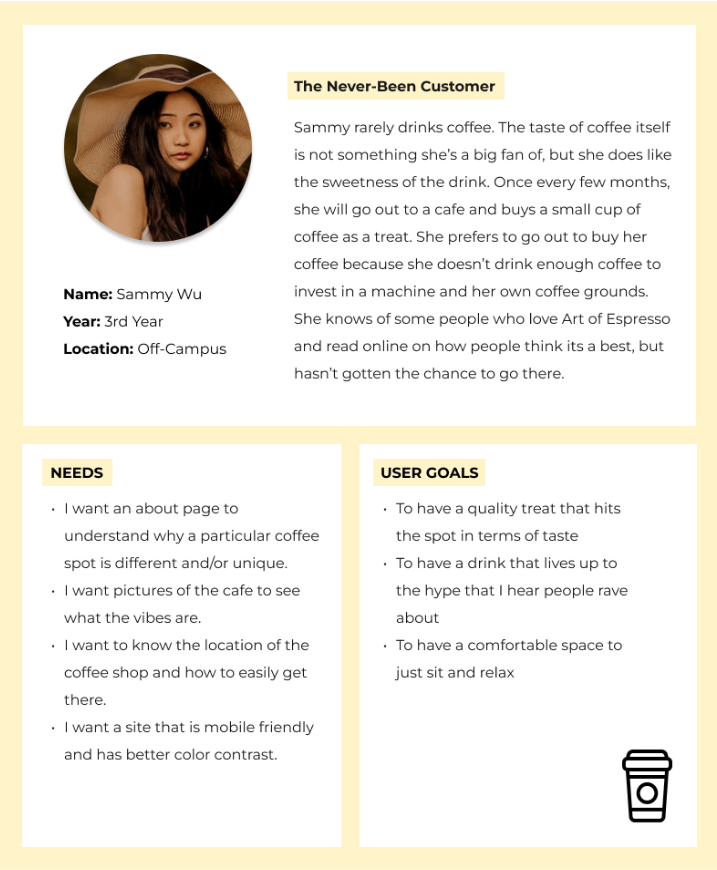
Our team conducted a total of 13 interviews with randomized UC San Diego undergraduate students who all have different backgrounds in terms of drinking coffee. All of the interviewees have their own needs and wants for both drinking and visiting coffee shops. After conducting our user interviews, as a group, we synthesized our data and findings into 3 personas aimed at specifically targeting the Art of Espresso. Based on the information that our group collected and the 3 personas, we developed 6 user scenarios and use cases to give people more context of the audience that the Art of Espresso attracts that would use the website. This additional information combined with the features mentioned in our client survey led us to develop a compiled list of possible features for the Art of Espresso website.
Personas
User Scenarios
We had 6 user scenarios to more context of the targeted audience that the Art of Espresso website:
Scenario 1 : Catherine is fond of cafes with amazing customer service that has a comfortable vibe. She’s a regular at AoE because of these two features but doesn’t really know much about the café itself and its staff. She wants to know more details about them to check out more of the vibe. Also as a regular, she wants to save money since she purchases a lot from them, from drinking a variety of their specialty drinks to her usuals. Being a loyal customer, she wants to rep AoE and use it as well for the possibility of ‘bring your own mug.’
Competitive Analysis and Mood Board
This is the Competitive Analysis. We compared competitors websites and pinpointed features we liked and disliked.
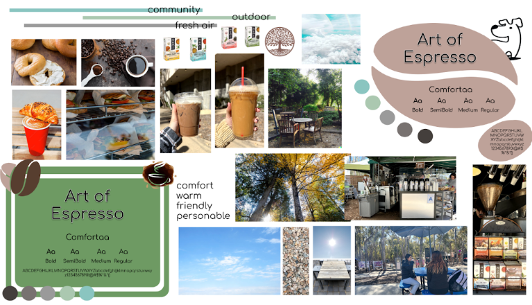
Mood Board:
Low-Fidelity Prototypes
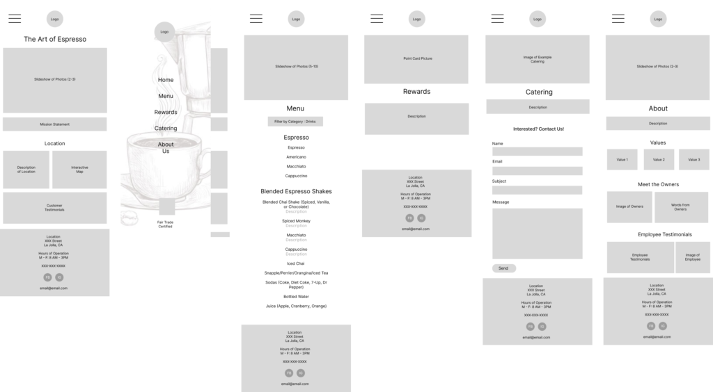
We decided that we only needed the low-fidelity prototype of the mobile app and used that as a template for both of our high fidelity prototypes.
User Research and Critiques
We were not able to get much user research for our low-fidelity prototype. However, we were able to get critiques from other teams that were in the same class. We were also able to get critiques from the teaching staff of the class. Those critiques can be seen here.
Final Product
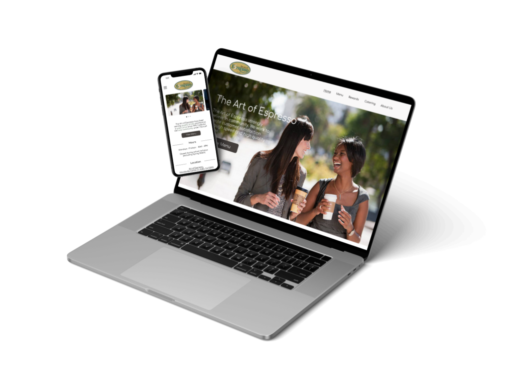
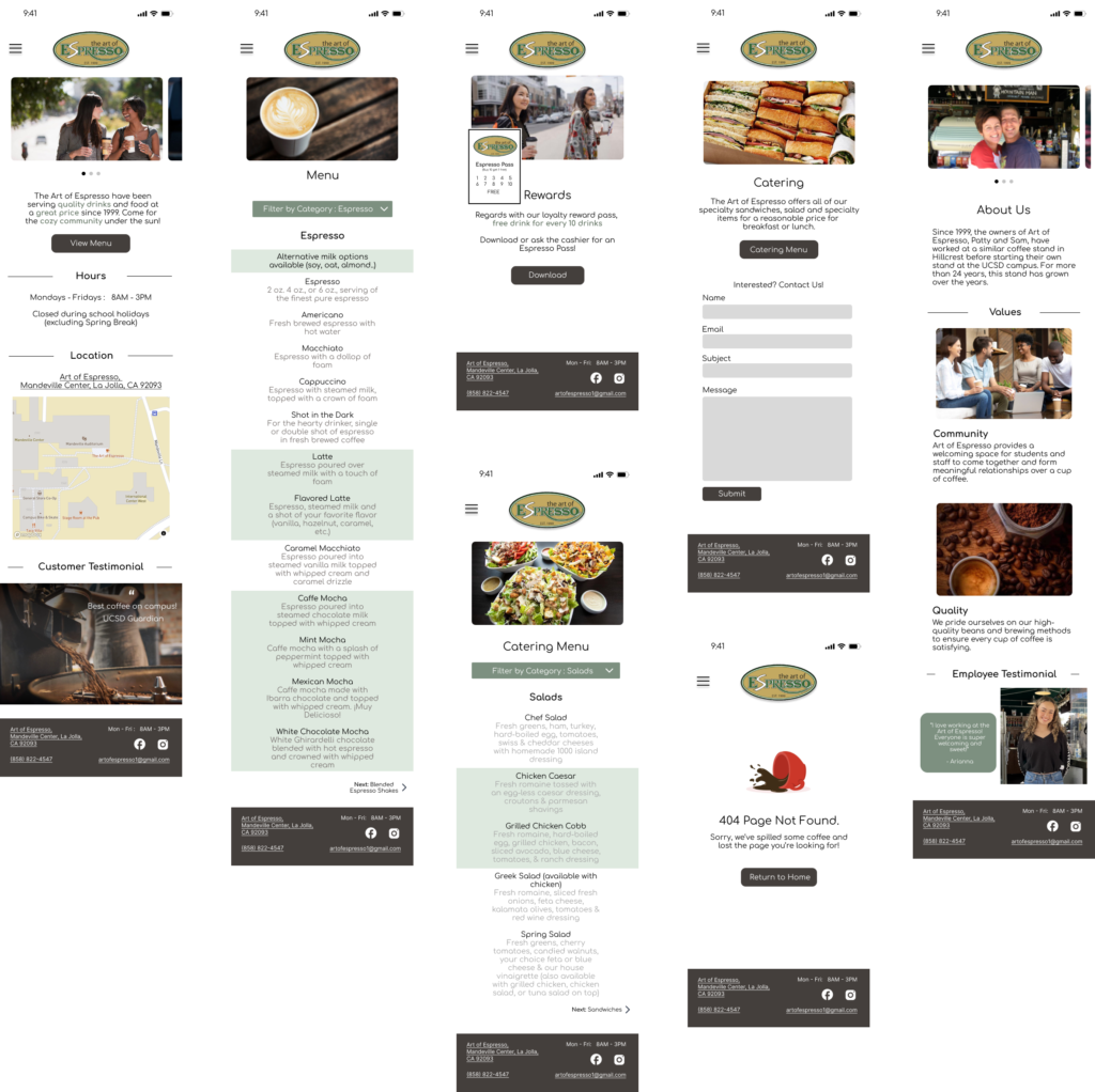
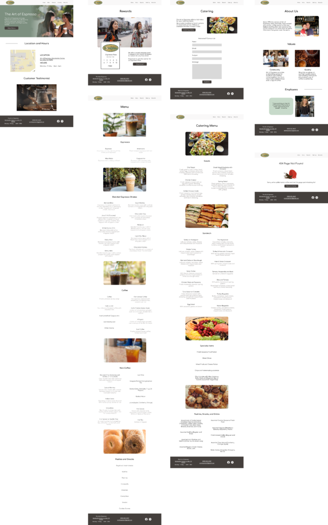
Here is a quick look at our final product. You can take a deeper look here.
There were several problems that we ran into while working on this redesign. One of the biggest problems is obtaining the pictures for the website. It took the team a long time to actually find pictures that actually fit the brand while not looking too much like a stock image. Another problem that we can into was user research. While working on the project, we were very limited on time so we were not able to obtain all of the user research we needed to improve our redesign of the AoE website.