This project was for a ACM club, a computing org at UCSD. My team chose to redesign the UCSD app. The team spent 6 weeks researching, user testing and redesigning a UCSD to be more modern and less cluttered and bland.
In this project I was a the team lead, where I did things like delegated task and set up meetings for the team.
The Problem
How can we improve the UX of the UCSD app while maintaining the UCSD identity?
Our Solution
Our solution for the problem we came up with was a complete visual overhaul of the app. This solves the issue of ugly interfaces by completely revamping the aesthetic identity of the app and making the cards visually consistent with each other. This also solves the issue of over-cluttering info by trimming down the unnecessary features of the app and focusing on the parts that people use more often. We re-arranged the features so that they would be consistent and easy for users to find.
Research Questions
We found UCSD students who had used the UCSD app at least once and conducted interviews to see the main pain points and concerns that users had with the app. Here were the questions we asked:
How often do you use the UCSD app?
What do you usually open the UCSD app for?
Do you find it easy to fulfill this purpose, why or why not?
What feature(s) do you use most?
Are there parts of the UCSD app that you don’t use?
How do you feel about the aesthetics of the UCSD app?
Do you think there are any potential areas of improvement for the app?
Research Findings
Here are some of our findings, based on 14 conducted interviews:
Most people (11/14) have only ever used the UCSD app once or twice
People typically use the UCSD app for the following:
Accessing their school ID, COVID testing, class schedules, and checking the hours for Geisel Library.
Half of the interviewees said that the app doesn’t fulfill its intended purpose
Many complained about random logouts, bad UI, and unresponsive app behavior
Many found the app to be “too professional” and “aesthetically boring”, while others complained about the large amount of scrolling and information overload.
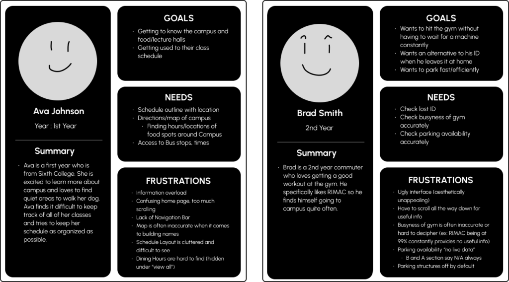
Personas
After my team did our research we turned what we our findings into 2 personas that represents our results. This allowed us to understands the needs and wants of the different users.
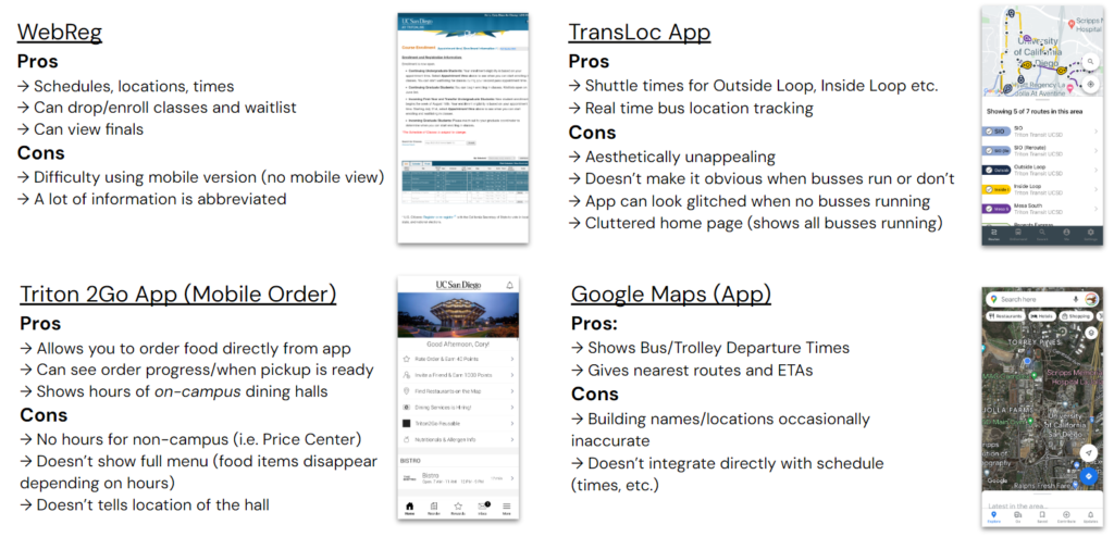
Competitive Analysis
For the competitive analysis there we analyzed apps with similar features that the UCSD app has. We chose to analyze Webreg, TransLoc, Triton2Go, and Google Maps.
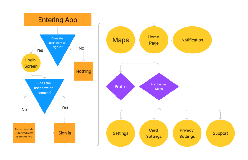
UX Flow
During our design process we built a UX flow to help us to see what are all the pages we need as well as seeing how the pages interact with each other. This gave us a general idea of how to design our sketches and lofi model.
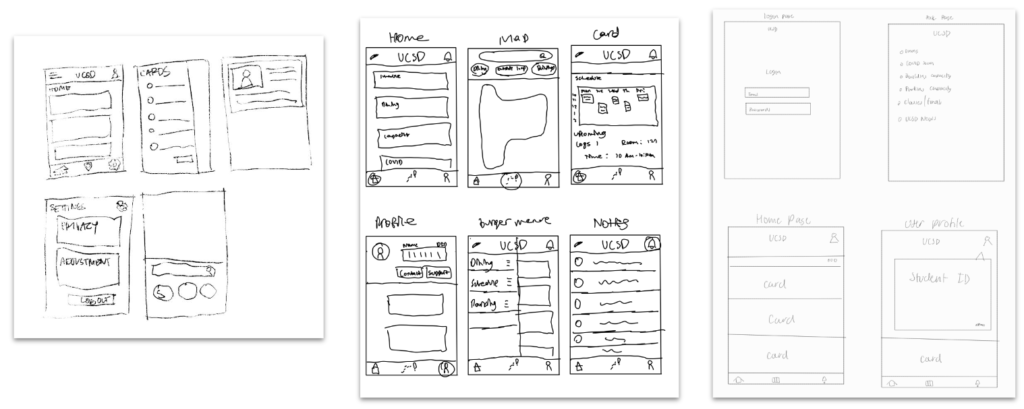
Sketches
Here are our sketches implementing the ideas from out brainstorm and UX flow.
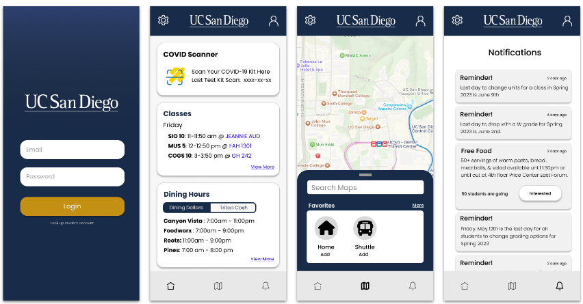
Low-Fidelity Prototypes
After we discussed the featured we liked from our sketches, we combined those features to create the lo-fi mock-up of the UCSD app.
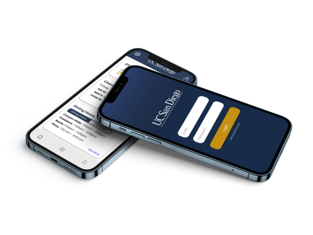
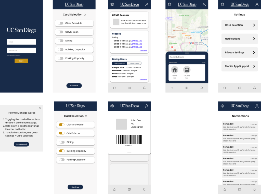
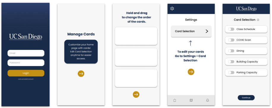
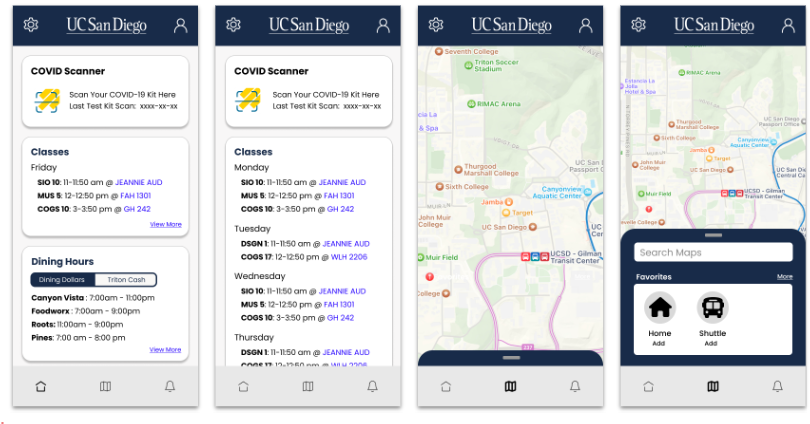
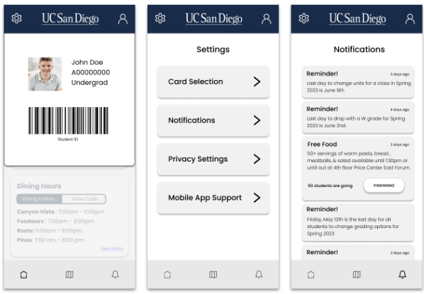
Final Product
This is our final product:
During the design project we faced a lot of challenges. The first challenge was the limited time. We had to rush various aspects of the projects to actually get the project finished. This causes use to miss a few steps of the design process as well as not being able to spend enough time on the other steps of the process. In particular we were not able to spend as much time doing user research or brainstorming. Another challenge we encountered was that all of our group members were very busy, so we were not able to work on the project or have meetings to talk about the project.